Don't let this wreck a perfect script
November 7th, 2025
|
10
min read
Sometimes, a well-written script can be wrecked by the editing.
Not by fancy effects, fast cuts or other creative choices.
But by overusing (or misusing) the simple visuals I'm about to reveal.
Here are the 7 easy-to-miss visual mistakes that I've repeatedly seen wrecking retention (so you can tell your editor to avoid them).
1/ Text appears out of sync with your voice.
Let's say you're using text to reinforce a payoff you're delivering at the end of a segment.
The audio (you speaking) and the visuals (text appearing) must be synchronised.
Yet I've often seen text appearing faster than the YouTuber is speaking.
But why is this a problem?
The reality is, your viewers can scan text faster than you can speak.
So if the text has fully appeared before you’ve finished speaking, the viewer will get bored waiting for you to finish saying what they already read.
Ideally, text should appear exactly in sync with your voice.
BUT, if it has to skew one way, it’s better for the text to appear slightly slower than your voice.
2/ Relying on stock B-roll that hides your face.
Truly... TRULY... static A-Roll is preferable to impersonal, boring, ten-a-penny B-Roll.
An online inspiration of mine, Kieren Drew, recently started on YouTube, and his videos are packed with incredible information.
But, as a YouTube newbie, he's falling for the "B-Roll is better" trap.
In the first 5 seconds of this video, he's disappeared from the screen entirely, and we're left watching a rotating cycle of generic B-Roll.
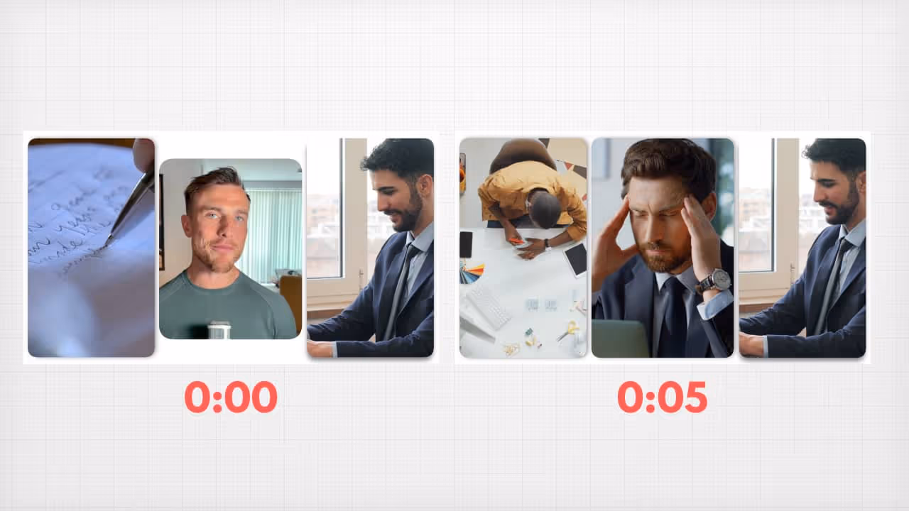
The fact that stock footage makes the visuals "varied" doesn’t “hack” my attention… it just makes me lose my connection to you.
3/ Text almost matches the audio (but doesn't).
I’ll often see a YouTuber begin a segment saying something like this:
- “Next, let's talk about the very worst thing to do right after your first ayahuasca session.”
Meanwhile, the text used to reinforce this says:
- “Just done ayahuasca? Avoid this for 24 hours!”
The problem is, if your viewer notices a discrepancy between what they see and what they hear, they're likely to ascribe meaning to it, assuming it's something you've done deliberately.
This is a psychological phenomenon called "illusory pattern perception", where meaning is derived by the observer, even if there is no meaning.
And even the 0.5s it takes them to verify that what they saw and what they heard were saying the same thing, but in slightly different ways is enough to cause "comprehension lag".
In that time, they've missed the next thing you said, and they now have to try and catch up.
So make sure on-screen text headings like this contain highly similar vocabulary to your spoken word (e.g. "The Worst Thing to Do After Ayahuasca")
4/ Confusing visual “language”.
Recently, I saw a video that used a small “checklist” style graphic in the hook to represent the key points he would reveal during the video.
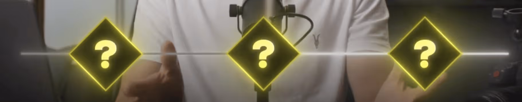
So far, so good - this helps illustrate the video’s structure.
But then, he used the same graphic later to create an entirely different “list” related to a different topic.
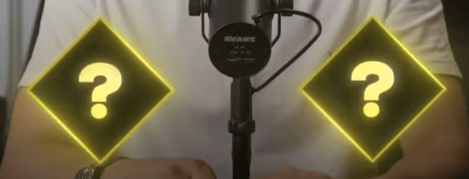
Avoid this at all costs.
If you’ve used a graphic during the hook to help create a sense of the video’s structure, do not use that same graphic for another list within the same video.
5/ Lots of text with no visual guide indicating what to focus on.
For example, if your video contains a screen-recording of an article, or a large wall of text in any other context.
You must guide your viewer's eye to the relevant text, even if you're reading it out.
Otherwise, our eyes will wander and we'll lose track of what you're saying.
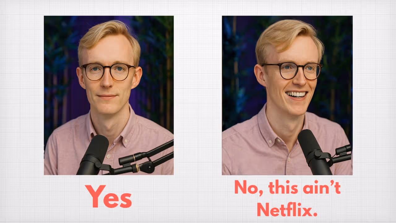
6/ Including a second camera angle to make it look like... you're being interviewed for a Netflix show?
Ok... I have no retention-based evidence that this is bad.
And I know it's helpful to cut between angles so you can hide any mistakes.
But it looks kludgy af and you should stop it 😆
7/ Text is thrown on-screen for the sake of it.
Whenever we put text on-screen, this ascribes it a degree of importance.
So overusing text will reduce its effectiveness in moments that truly do matter.
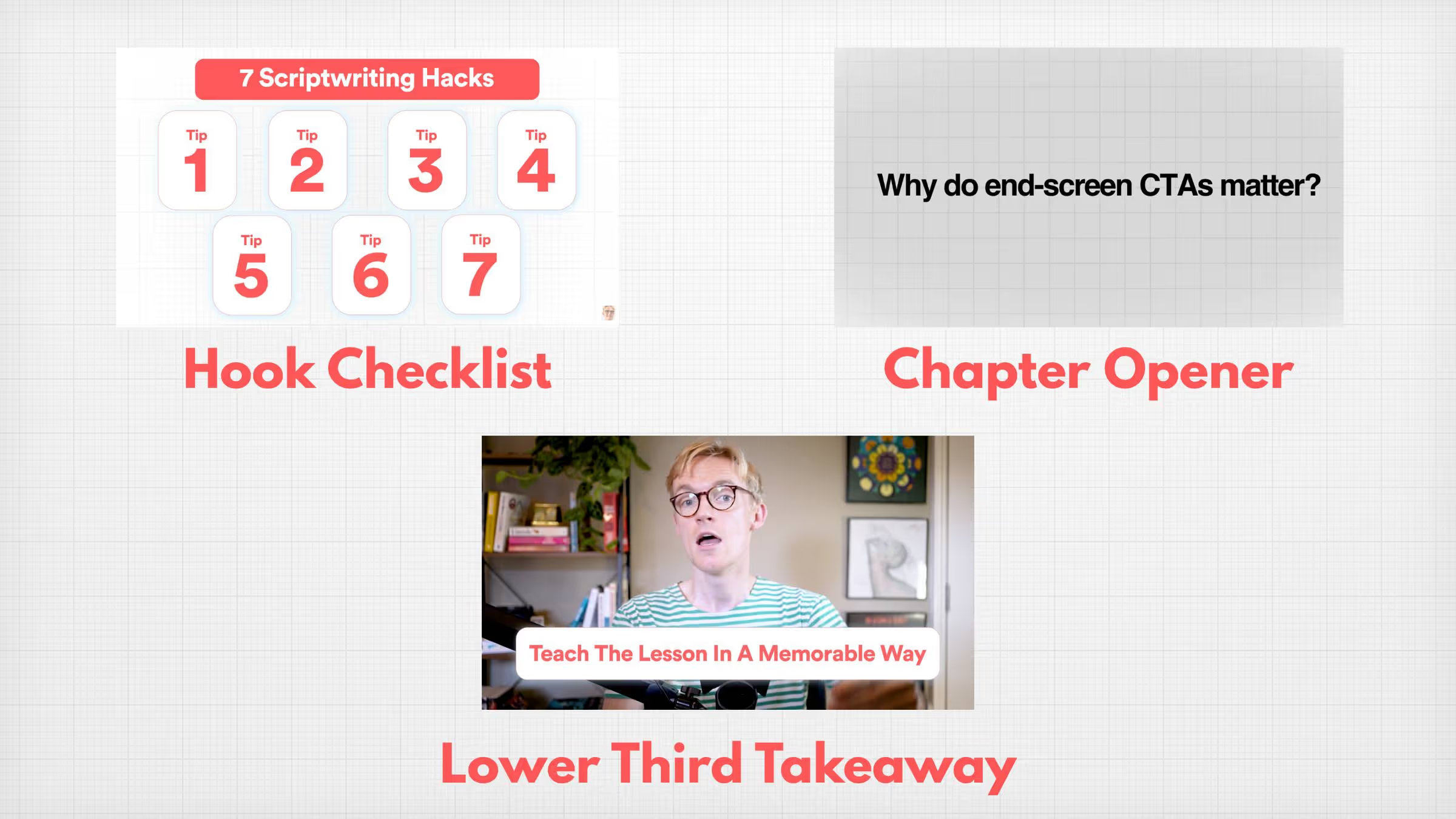
Ergo, be picky with when you use text - on my channel, I’m pushing towards only using it in 3 instances.
- Hook checklist.
- Chapter opener.
- Lower-third takeaway.
Remember: if a visual isn't actively increasing the viewer's clarity, it's either doing nothing - or it's reducing their clarity.
That's all for this week.
Any questions? You can to reply to this email and I'll get back to you.
Speak soon,
George 👋
Create more engaging videos with simple, actionable scriptwriting tips.
Join 6,000+ scriptwriting nerds reading “Write On Time”. Insights from writing for multi-million subscriber YouTubers sent to your inbox every Friday.